The ABC Atlas aims to empower researchers worldwide to explore and analyze multiple whole-brain datasets simultaneously. As the Allen Institute and its collaborators continue to add new modalities, species, and insights, this groundbreaking platform will keep growing, opening up endless possibilities for discoveries and breakthroughs in neuroscience, and helping researchers everywhere advance our understanding of this amazing organ in ways we never thought possible.
In addition to incorporating new data regularly, the ABC Atlas will continue to be updated with new features and capabilities. Please let us know what you like, what you don’t like, and what you’d like to see in future updates!
Overview
The icon panel on the left allows quick navigation between Control Panel tabs. The filters and settings on each tab all work together to change what is displayed in the visualization frames to the right.
There are five tabs, each controlling a different aspect of the visualizations:
- View Manager - Find data to add to your view, adjust view settings, and change the layout. Opens the Manage Layout panel.
- Cell Properties - Filter and color by data features and values.
- Genes - Search, select, and color by gene expression.
- ABC Atlas Assistant - Find data, change views, and get information - just ask!
- Share - Share your view, download data, and export colors.

Undo and Redo
The back and forward arrows at the bottom of the icon panel reverse and reapply your recent actions. These include applying filters, changing what a view is colored by, adding or removing views, changing pan and zoom camera positioning, and more. You can also undo with Ctrl + Z, or Command + Z on a Mac.

Manage Layout & Browse Data Sets
The View Manager tab opens the Manage Layout panel, which allows adding, changing, and reordering visualization frames. View settings like point size and opacity can also be accessed here. ABC Atlas supports up to four views in multiple configurations, listed under Current Views. Frames you have not filled yet appear as “None.”

Adding and changing views
- To add a new visualization, click Add Visualization to open the Add panel, then click the Dataset dropdown menu to scroll through available data sets, grouped by atlas. Use the search box to find one by name. Click a data set name to load it into the selected frame.

- To change the data set click the data set you wish to replace to show View Configuration, then click the Dataset drop down to scroll through available data sets. Click a data set name to load it into the selected frame, replacing the one already there.
- The layout orientation can be changed by clicking the icons at the top of the panel. Change the order of views by dragging and dropping a row in the list.

View Configuration
Settings for each view are found in the View Configuration panel. Open it from the Manage Layout panel by clicking a data set, or at any time by clicking the gear icon to the right of the data set title at the top of a view. Selections made in View Configuration will only apply to the selected view.
Visualization
The Visualization dropdown selects how the cells in the frame are arranged, for example a coronal grid of sections or a UMAP. The options available depend on the data set being viewed.

Highlight on Hover
When Highlight on Hover is checked, hovering over a cell temporarily increases the size of other cells that share that value. See Highlight on Hover under Visualization Frame for a full description. Uncheck the box to turn this off for the selected view.
Resolution/Performance
Use the Resolution/Performance slider to trade rendering speed against image quality. Rendering millions of points relies on a sampling algorithm that lowers resolution when you are zoomed out, and the slider shifts that balance in either direction. The best setting depends on the data set and your machine, so it is worth experimenting.
Note: Your device, internet connection, and browser all affect performance and loading speed. For best results we recommend an up-to-date version of Chrome with unnecessary programs and tabs closed. If performance is poor, tell us through the feedback survey and include your system details.
Filtered In and Filtered Out
Cells that match your current filters and cells that do not can be styled independently. View Configuration provides a Filtered In group and a Filtered Out group, each with its own controls.
- Point Size - Move the slider to the left for smaller points (for less overlap) or to the right for larger points (for denser visualizations). Points will dynamically resize as you zoom in or out relative to the size selected. You can also adjust point size without opening View Configuration by holding Ctrl and scrolling your mouse wheel over the view.
- Point Opacity - Move the slider between 0 and 1 to adjust how visible the points are. Setting Filtered Out point opacity to 0 will hide the unselected cells completely.
- Filtered Out Color - Check this box to apply a single color to all filtered-out cells, and click the pencil icon beside it to choose that color.

Cell Properties
The Cell Properties tab lists the features available for the selected data set, along with the total number of cells it contains. Each feature can be expanded to show its values.

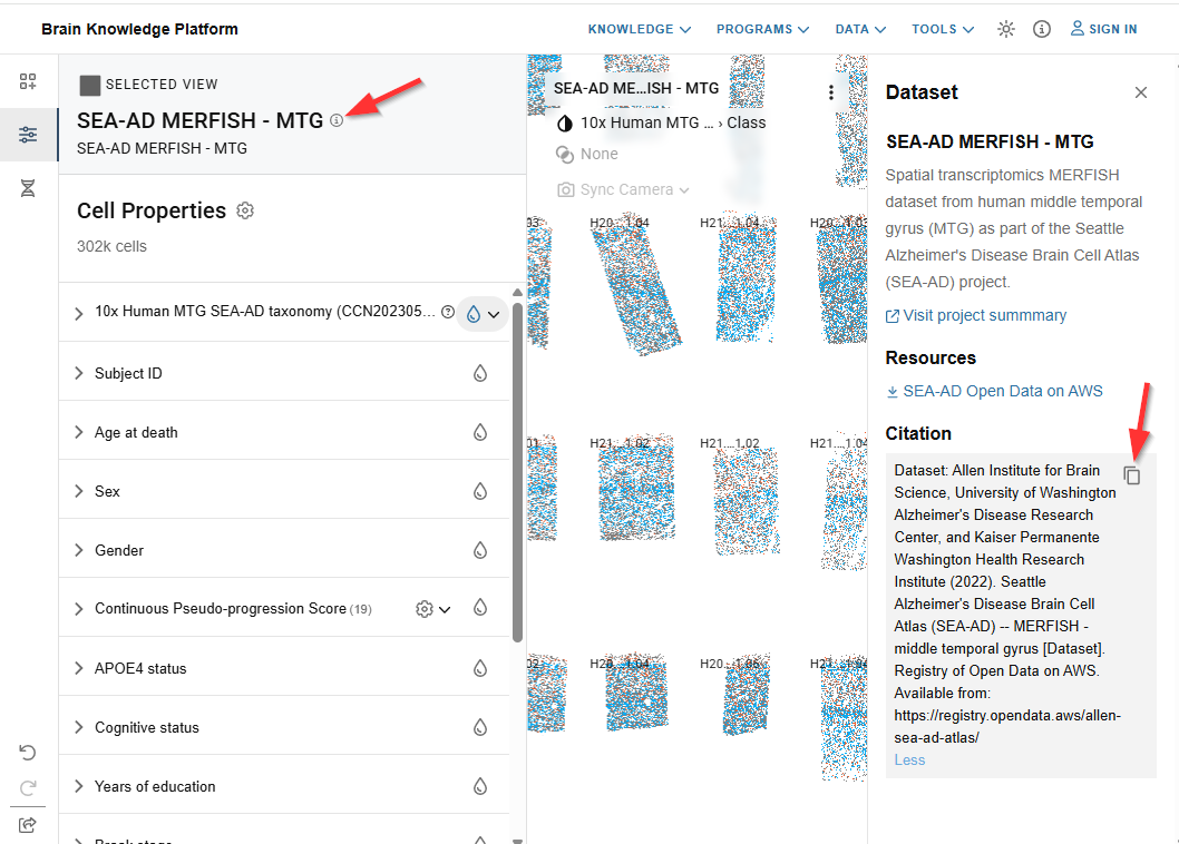
To learn more about the selected data set including download links, sharing, and citation tools, click the (i) icon next to the data set name.

Color
-
You can apply color to your visualizations to distinguish cells by category or by gene expression level.
-
The list of values under the feature you’re coloring by serves as the legend, showing which color corresponds to each value. Hovering over a colored region in the visualization also displays its label.
-
Color may only be applied with one feature at a time.
-
Click the droplet icon to the right of a feature to color by that feature. The currently colored feature is indicated by a gray circle highlighting its droplet.
-
For hierarchically nested features, the droplet will have a small arrow to the left. Click the arrow to display a dropdown menu to display the available levels. Click a level to apply color.
-
Expand a feature to see its values. Each value has a checkbox for filtering, its name, and the number of cells that carry it.
-
When you color by a feature, values under the other features show the distribution of cells in the next lower level of the hierarchy as a horizontal bar next to that value. When a filter is applied, only the selected value or values display this bar.


Overriding a color
Default colors are selected intentionally to align metadata colors with paper publication figures and across data sets. You can replace any of them with a color of your own: to improve accessibility, to distinguish values whose default colors are similar, or to match colors used in your own data.
- Color a view by the feature you want to change.
- Click a cell that has the value whose color you wish to change to open the Cell info card.
- Click the pencil icon over the color dot to the left of the value name to reveal the color picker.
- Select the new color from the gradient and hue slider, or type a value into the text box. The arrows to the right of that box switch the box between HEX, RGB, and HSL.
The view updates as soon as the color changes, and your override is saved automatically.


To undo a single change, reopen the picker and click the icon in its upper right, “Reset to original color.”
To see and manage all of your overrides, click the pencil icon to the right of the Cell Properties heading. Each override is listed with the feature it belongs to and the value it applies to. Click the “x” beside one to remove it, or Clear all to remove every override at once.

Tip: Overridden colors can be exported from the Share panel. See Export colors.
Filtering
- Color may be applied to a subset of cells in the visualization using filters.
- Multiple filter selections within a feature will include any cells that meet either criterion (OR), while multiple filter selections across features will only display cells meeting all criteria (AND).
- When no filters are selected, the total number of applicable cells appears next to each value within a feature. Once a filter has been applied, only the selected values show cell counts; unselected values display zero.
- To filter cells from your active frame, check the box next to a value you wish to see colored. Cells with any other value within the feature will be grayed out. See Filtered In and Filtered Out to adjust how these cells appear.
- When filters have been applied, a Clear filter button appears at the top of the Cell Properties panel showing how many filters are active. Click it to remove all of them at once.
- See Filters Summary to review or remove a frame’s filters directly from the view header.
Filtering by clicking a cell
Cells can also be added to and removed from a filter directly in the visualization.
- Hover the cursor over a cell of interest.
- While the tool tip is displayed, click the cell. The view will be filtered to color those cells that share the identified value.
- Click the cell again to remove the filter.
- Hover over a cell with a different value and click again to add values to the filter.
Numeric features
Some data sets include features with continuous values rather than categories, for example Continuous Pseudo-progression Score in the SEA-AD data sets. These work like genes rather than like categorical features: expand the feature to expose a histogram, then filter by range as described under Gene Expression Filtering. Two things differ. The values run through a continuous color map instead of one color per value, and the histogram bars match the view.
Sorting and searching values
- Click the sort icon in the feature header to reorder that feature’s values from highest to lowest cell count. Click the icon again to revert to the default order. This is especially useful after applying other filters.
- Click the search icon in the feature header to search within that feature’s values. This is the fastest way to find a specific value in a taxonomy with many clusters.

Display Properties
Long feature lists can be shortened to just the properties you are working with.
- Click the gear icon to the right of the Cell Properties heading to open Display Properties.
- Check or uncheck properties to show or hide them, or use the search box to find one by name.
- Click “Show selected” to display only the properties you have checked.
Note: Properties with filters and/or color applied cannot be hidden.

Cell Type Cards
Cell Type Cards show additional information about a cell type’s taxon while you are viewing it in ABC Atlas.
There are three ways to open a card:
- In the Cell Properties panel, hover over a cell type name to show the Learn more button. Click it to open the card on the right.
- In a view colored by cell type, hover over a cell to show the tool tip. Click the tool tip to reveal the action buttons, then click “Learn more” to open the Cell Type Card on the right.
- In the Cell Selection Summary panel, click the icon beside an aggregation group name to learn more about that cell type.
Each card has two tabs, Overview and Marker Genes.

Note: Cell Type Cards display information about the taxonomy and the reference data used to create them. If you are viewing a data set that has been mapped to this taxonomy, some attributes shown on the card may not be present in every data set. For example, genes used in the cell type name may not appear in the data set you are currently viewing.
Nomenclature
On the Overview tab, each component of the cell type name is represented in a box with the full name of the entity and a tag indicating the general entity type, for example anatomical, gene, or cell type.
Taxonomy
Below Nomenclature, general information about the taxon including its taxonomy level, the taxonomy it belongs to, the organism, and links to its parent and child nodes.
Marker Genes
For supported cell types, the Marker Genes tab on a Cell Type Card displays one or more sets of marker genes that help distinguish that cell type from its neighbors. Each set is named for the taxonomy level it applies to, and some are further qualified, for example “subclass (transcription factors)”.
- To learn more about a set of marker genes, hover the cursor over the (i) to the right of the marker gene set name.
- Click the Add set to genes button under a set of marker genes to add those genes to the Genes tab. The active view will be colored by the expression of the first available gene in the list.

Note: The genes referenced on a Cell Type Card were those used in the creation of the taxonomy and may not be available to visualize in the data set currently being explored.
Note: Clicking the Marker Genes tab sometimes displays the message “No marker genes found for this cell type.” This indicates that marker genes are either undefined or unavailable for that cell type. This is especially common for the top levels of some taxonomies. In this case, selecting a lower level cell type may yield better results.
Genes
On the Genes tab, search and select multiple genes in the Search by gene symbol field, or use the Add batch button to add a comma separated list of genes all at once. The number of genes available in the current data set is shown above the search field. Click Clear to remove all selected genes.


Note: Each view may only be colored by one gene at a time. To see multiple genes, create additional views or toggle between genes using the color droplet icon.
Gene Expression Filtering
To filter views by gene expression value, from the Genes tab, after selecting a gene, click the arrow to the left of the gene name to expose the expression histogram. Click anywhere in the histogram to initiate filtering, then click and drag the vertical bars to adjust the values shown in your filter. To remove the filter, click the eraser icon to the right of the gene name.
You can apply expression filters to more than one gene at a time, filtering your view down to the cells that coexpress them. Repeat the steps above for each gene you want to filter by.
Additionally, when a filter is applied, the histogram of other genes will reflect the distribution of the filtered cells.
Note: While you can filter by any number of genes at once, you can still only select one gene or other feature to color the cells in the view by.
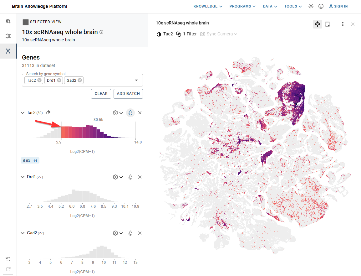
Tip: You can filter by gene expression values while coloring by a different feature, including other genes.
Gene Expression Settings
Inverse Color
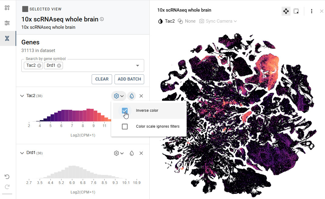
To invert the light and dark range of the color map, click the gear icon to the right of the gene name and check the “Inverse color” box.
Color scale
When a filter is applied, the color map will automatically redistribute to the highest and lowest values within the selected range. To apply the color map to the entire range of expression values, even those outside the filtered range, check the “Color scale ignores filter” box in the gene settings.
Sharing, Downloads, and Citation
Share
Click the share icon on the left to open the Share panel. The panel gives you a link to your entire view, and a separate section for each frame in your layout.
Share the entire view
The link at the top of the panel saves the state of all views including filters, colors, and camera positions, and can be shared with others or saved for future reference. Click the copy icon to the right of the URL to copy it.
Share and export by frame
Below that, each frame in your layout has its own section containing a share URL for that frame, its data download links, and its color export options. Use these to send a colleague one specific visualization instead of your entire layout.
- Click the share icon on the left to open the Share panel.
- Under Share and export by frame, find the frame you want by its title.
- Click the copy icon to the right of that frame’s URL.
Click “More” below any URL to see the full link, and “Less” to collapse it again.

Note: A frame URL opens in a single-pane layout. It restores only that frame, not the rest of your layout. To share everything, use the link under Share the entire view at the top of the panel or copy it straight from your browser’s address bar.
Data downloads
Each frame’s section in the Share panel includes the data download links for the data set in that frame. Download links are also available in the Dataset info panel, under Resources.
Export colors
Each frame section has a collapsible Export colors group.
- All colors exports every color currently applied in that frame.
- Overridden colors exports only the colors you have changed yourself. See Overriding a color.
Both are available as CSV or JSON.
- In that frame’s section, click Export colors to expand it.
- Click CSV or JSON on the row you want.

Note: The Overridden colors buttons stay unavailable until you have overridden at least one color in that frame.
Project Citation & ABC Atlas Tool Citation
To cite the ABC Atlas tool click the info icon in the top navigation bar then click the copy icon under Citations in the right panel.

To cite the data displayed in ABC Atlas click the Dataset info icon to the right of the data set name in the Cell Properties tab. This will open the Dataset panel to the right. Look for the Citation section and use the copy icon to copy the full citation to the clipboard.
Visualization Frame
The ABC Atlas allows you to view up to four visualizations at the same time. When viewing multiple visualizations, the active frame is indicated by a bold outline. Only the active frame will be affected by selections made in the Control Panel.

Each view has a header containing its data set title, an (i) icon that opens the information panel for that data set, a gear icon that opens View Configuration, and the controls described below. If your browser window is narrow, some of these controls collapse into a ⋮ overflow menu at the right of the header.
Filters Summary
A badge in the view header shows how many filters are active on that frame. Click the badge to open Filters Summary, which lists every active filter grouped by feature, gene expression filters included. Click the “x” beside a value to remove that filter on its own, click the eraser icon beside a feature name to clear all of that feature’s filters, or click Clear all to remove every filter on the frame.

Note: The badge reads “None” and is inactive until the frame has at least one filter.
Tool tips
Hovering your mouse over a cell will display details of the cell’s color. For example, if your visualization is colored by Class, hovering over a cell will show which class the cell belongs to. If multiple cells overlap, the most common cell in the area will be shown.
If the data supports anatomical overlay, the tool tip will also show which anatomical area the cell is in.

Docking the tool tip
By default the tool tip follows your cursor. You can dock it to the bottom left of the frame instead.
- Click a cell to open the tool tip.
- Click the boxed arrow to dock the tool tip to the bottom left of the frame.
- Click the boxed arrow again to return the tool tip to following your cursor.
While docked, the tool tip still reflects whatever is under your cursor, and hides when your cursor leaves the frame.
Note: Your choice is stored locally in your browser and remembered across sessions. Changing browsers or clearing your browser history will reset it.

Highlight on Hover
Highlight on Hover lets you quickly see and compare cell property values which are shared across data sets.
When hovering over a cell, in addition to the cell property displayed in the tool tip, other cells in the view temporarily increase in size to show where else that value occurs. If other data set views are open with cells that share that value, those cells will also temporarily increase in size.
For example, when viewing the Zeng and Zhuang whole mouse brain data sets side by side and coloring by cell type in both views, hovering over a cell type in one view will highlight the same value in the other view.
This same cross-view highlighting can also be achieved by hovering over a value in the Cell Properties panel on the left.
To turn this off for the selected view, open View Configuration and uncheck Highlight on Hover.

Anatomical annotations
Data sets that support anatomical annotations can display anatomical region boundaries in front of or behind the cells.
Click the annotations icon in the view header to open the Annotations panel:
- Use the drop down menu to choose the granularity of the anatomical divisions shown, for example Anatomical Division.
- The (i) to the right of the drop down shows additional information about the annotation data, such as version numbers, if available.
- Turn on Annotations in the front to draw the annotations over the cells. Turn it off to draw them behind.
- Under Options, turn on Stroke to display outlines of the anatomical regions, or Fill to show a solid color in each region. Both can be on at once.
- Set an opacity percentage next to the droplet beneath Stroke and Fill independently.

Note: Registration to the whole mouse brain was applied at a coarse level to account for brain size, sectioning angle and location of major anatomical division. Cell type based anatomical landmarks were used to further refine registration in the isocortex and thalamus. Regions around tissue artifacts may result in alignment anomalies.
Duplicate View
In the top right of the selected view, clicking Duplicate View will create a new view with the same colors, filters, pan, and zoom settings as the active view.

Download image
Clicking Download image creates a high-resolution image of the selected view and initiates the download through your browser.

Remove
Click Remove in the upper right of the active frame to remove it from your layout.

Navigation modes
- ABC Atlas has two navigation modes, Pan and Select cells. Only one is active at a time. Both are set by the icons in the top right of the active frame, which also show which mode you are in.
- Pan is the four arrows; Select cells is the perforated square.

Camera Controls (Pan)
- Use your mouse scroll wheel to zoom in to view more detail or out to see more of the visualization at once.
- Click and drag to view a different area of the visualization.
Camera Syncing
Camera Syncing creates spatial sync groups between views of the same data set, allowing you to control two or more views at once. When syncing is enabled, as you zoom in or move the “camera” in one view, synced views will follow, maintaining the same position. Syncing does not affect selected filters or colors so that you can compare different features in each view.
- To initiate Camera Syncing, click Sync Camera in the top right of the selected view.
- Check the box next to the view you’d like to sync with.
Now any change made to the zoom or pan state in one view will also be reflected in the other view.

Enabling syncing for additional views of the same data will add them to the original sync group.
Note: Only one sync group per data set is supported.
- Unselect the checkbox to remove a view from the sync group and allow the camera for that view to be controlled independently.
Slide View
Data sets comprised of spatial slices of tissue offer additional viewing options including the ability to scroll through slices while maintaining zoom and pan positioning.
- Advance through slices in order using any one of the following mechanisms:
-
Use the Previous Slice and Next Slice buttons at the top of the view
-
Hold the Alt key on Windows (Option key on Mac) and scroll the mouse wheel
-
Hold the Alt key on Windows (Option key on Mac) and press the arrow keys on the keyboard

- Show or hide specific slices to create a custom view by checking the box in the upper right hand corner of each slide to be shown.

Dynamic Grid
The Dynamic Grid menu in the view header keeps track of which slices you have selected. Click the Dynamic Grid icon to open it.
-
The top of the menu shows how many slices are currently selected out of the total, for example “0 of 53 selected”.
-
Check “Hide unselected” to remove the unselected slices from the view entirely. This stays unavailable until you have selected at least one slice.
-
Click “Clear selected” to clear all selections at once, which is quicker than unchecking each box.

Cell Selection
- In Cell Selection mode, click and drag to highlight cells in a specific region of the visualization to open the Cell Selection Summary panel.
- Once cells have been selected, the top portion of the Cell Selection Summary panel displays an aggregated view of the cells in your cell selection region grouped by your current color selection.
- The bottom portion displays the details of each cell in the highlighted aggregation group. Click on a different aggregation group in the top section to switch groups.

- Press the shift key once to enter Select cells mode. Press shift again to exit.
- Zoom and pan controls will continue to work even when in Select cells mode. Use the scroll wheel to zoom and hold the space bar to pan.
- When in Select cells mode, the selection box can be resized by hovering over the edge until the cursor becomes a double-sided arrow and then clicking and dragging to the desired size.

-
Details of the selected cells can be downloaded as a csv file. Click an aggregation group, then click the document icon to the right of the group name. Note: Only the first 100 cells are included. Full data set downloads are available via GitHub.

Keyboard shortcuts
These shortcuts are described in context in the sections above and collected here for reference.
| Shortcut | What it does |
|---|---|
| Ctrl + Z (Command + Z on Mac) | Undo your last action |
| Ctrl + scroll wheel | Change point size in the active view |
| Shift | Enter Select cells mode; press again to exit |
| Space bar (hold) | Pan while in Select cells mode |
| Alt + scroll wheel (Option on Mac) | Advance through slices in Slide View |
| Alt + arrow keys (Option on Mac) | Advance through slices in Slide View |
Header
Light/Dark Mode - Toggle between light and dark color scheme by clicking the sun/moon icon.

Help - Access information about the ABC Atlas including documentation, our community forum, and provide feedback and suggestions to help us improve your experience.

ABC Atlas Assistant
The ABC Atlas Assistant lets you explore and visualize data in the ABC Atlas using natural language. Describe what you want to see and the Assistant will find the right data, apply filters or colors, and update your view. Select the chat bubble icon in the left navigation bar to open it.
 Note: As with all Large Language Models this Assistant can provide wrong information. Please check the accuracy of anything important. Allen Institute staff have access to all chat interactions in our logs, so please don’t share anything in the chat you wouldn’t want other people to see.
For what the Assistant can and cannot do, how to phrase requests, and how to undo an action, see Introducing the ABC Atlas AI Assistant!
Programmatic Access
To access full data sets for programmatic analysis, go to our ABC Atlas Access GitHub page. This repo offers full data downloads for all ABC Atlas data sets as well as notebook tutorials to help you get familiar with the data’s structure and attributes.
Give us your feedback and suggest new features here: Allen Institute - Feedback